Packaging Design

The Challenge
Redesigning the packaging identity for India's largest pharmaceutical e-commerce platform, shipping 20,000 to 40,000 packages a day.
The Brief
The brief I got was to make the packaging better, literally.
As 1mg scaled rapidly, its packaging had organically evolved across departments, each solving problems in isolation. The company recognized an opportunity to bring these efforts together into a cohesive, intentional system that reduced the carbon footprint, strengthened brand recall, and made the unboxing experience feel like a natural extension of 1mg's commitment to care.
Research & Discovery
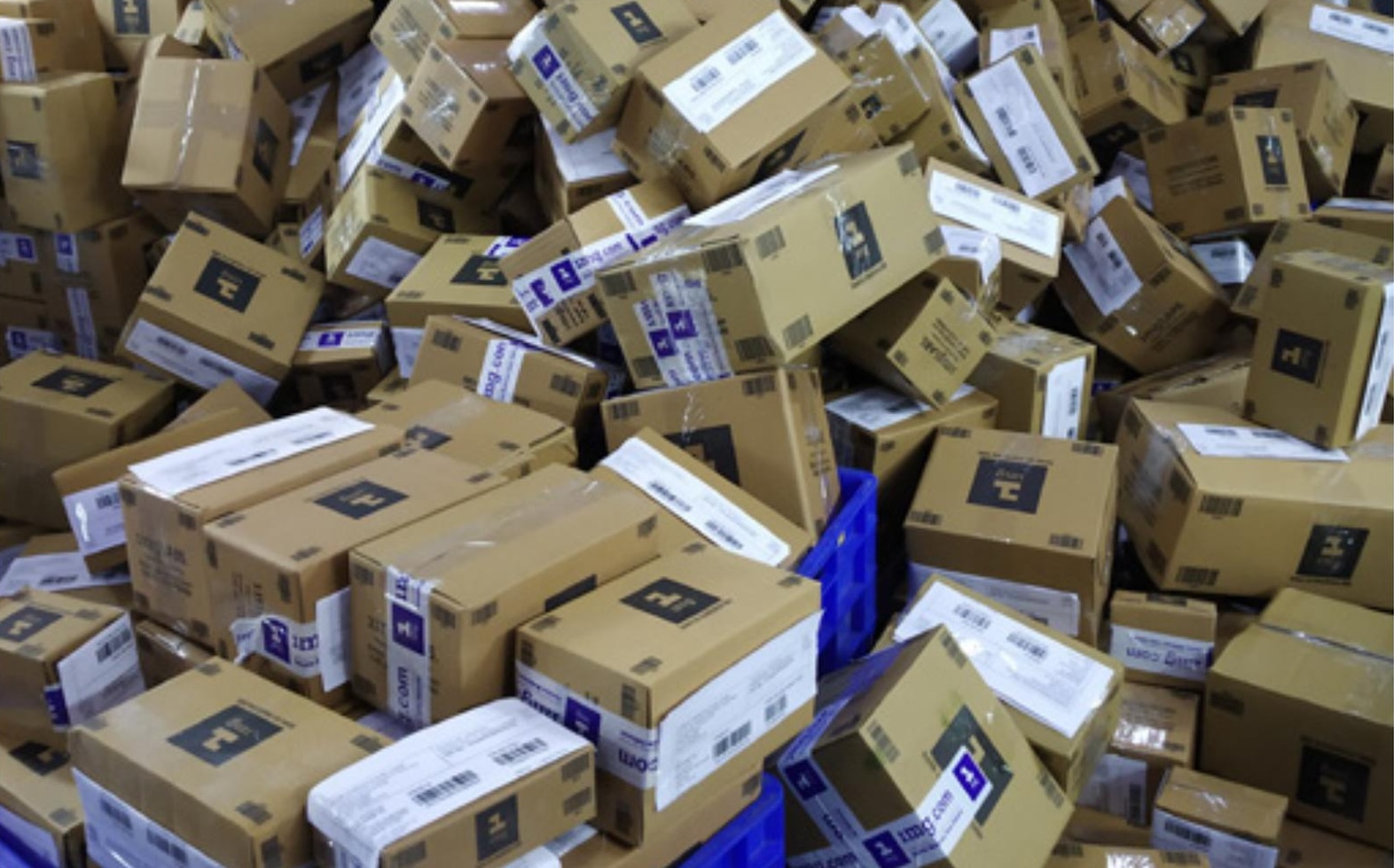
To understand the full scope of the problem, I started by auditing the current packaging end-to-end, gathering customer feedback that mentioned packaging, and combing through online reviews for any packaging-related complaints or observations. I also studied competitor and cross-industry benchmarks, and interviewed leadership and key stakeholders.
I interviewed leadership and key stakeholders to understand what kind of packaging they admired and why, drawing from other industries, competitors, and personal experiences. These conversations helped define the north star for what 1mg's packaging should aspire to be.
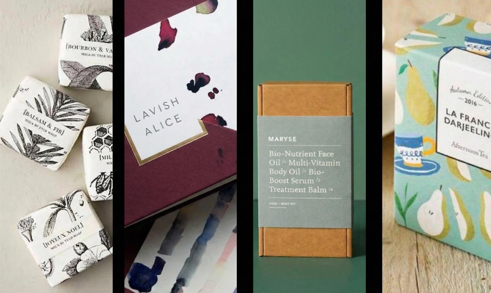
References gathered from leadership and stakeholder interviews
These findings pointed to two parallel workstreams: redesigning the packaging structure (box, bag, sealing, cushioning) and creating a visual identity that made the packaging feel warm, intentional, and worth remembering. What should a customer feel when a 1mg package arrives? That question became the through-line for everything that followed.
Visual Identity
1mg's brand was built around the experience of care, so that became the lens for every visual decision. I prioritized directions that evoked calm, warmth, and self-care, the kind of emotions that are inseparable from healing.I brought designers, PMs, engineers, and other stakeholders together for a collaborative sketching workshop where everyone put their vision for packaging on paper. The concepts were voted on as a group, and the highest-voted directions were then developed into real prototypes with the help of vendors.
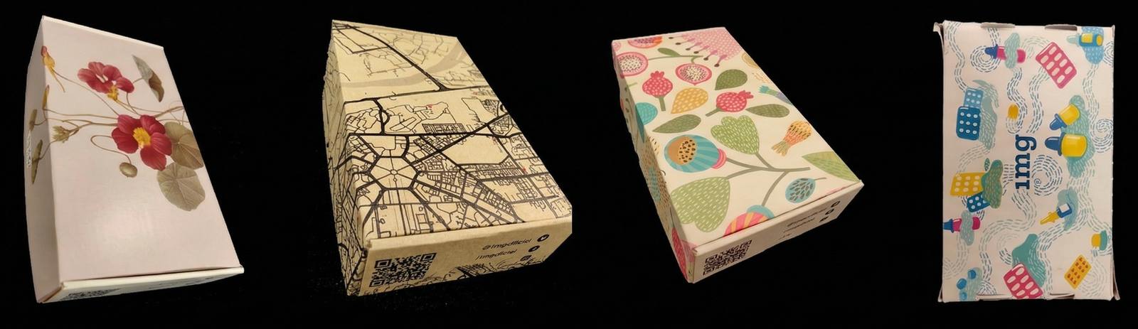
Developed concepst from the workshop

Concept that showed the story of medicine delivered
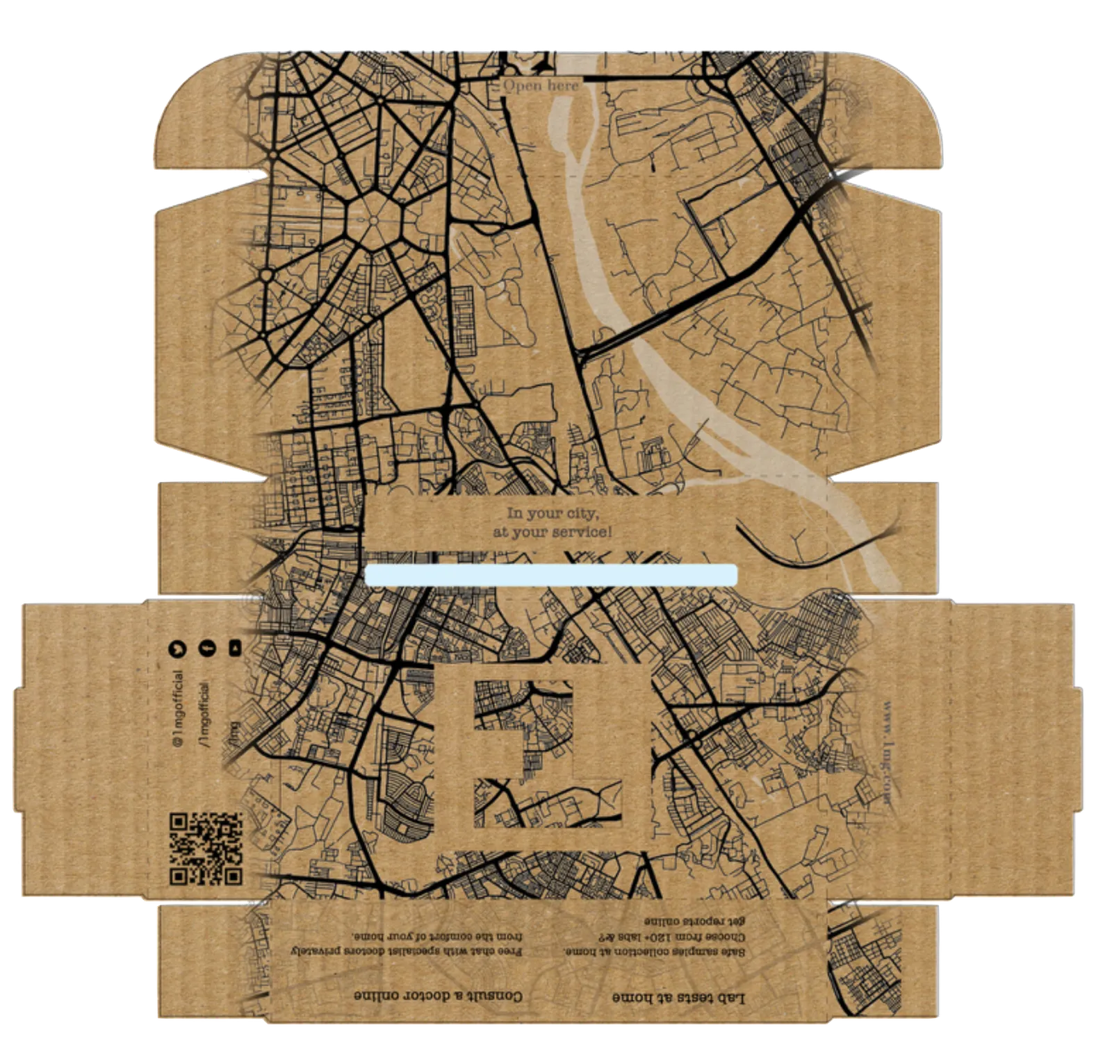
Concept with city-logistics on the packaging
The narrative illustration system won out, tracing the journey of medicines from nature to care. Black ink illustration on kraft paper carried that warmth naturally while staying scalable and cost-effective.
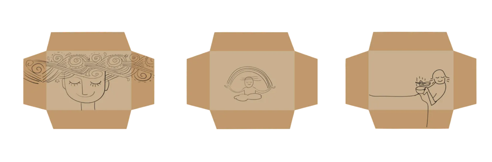
Emotions
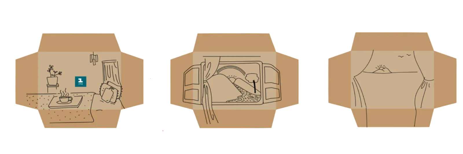
Experience
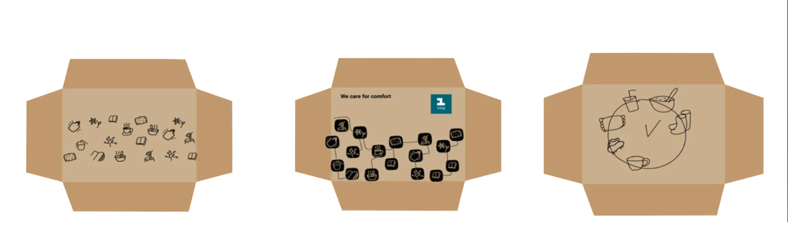
Treatment
Packaging System
After finalizing the visual style, I moved into 3D packaging design, working closely with an illustrator and the print vendor through multiple design iterations, testing everything from visual treatments to printed box samples. The aim was to create the warmest possible unboxing experience while staying within budget.
I evaluated four carton structures against four criteria: steadiness, self-locking ability, ease of closing, and ease of opening. Self-locking scored highest across the board, so that's where I started.
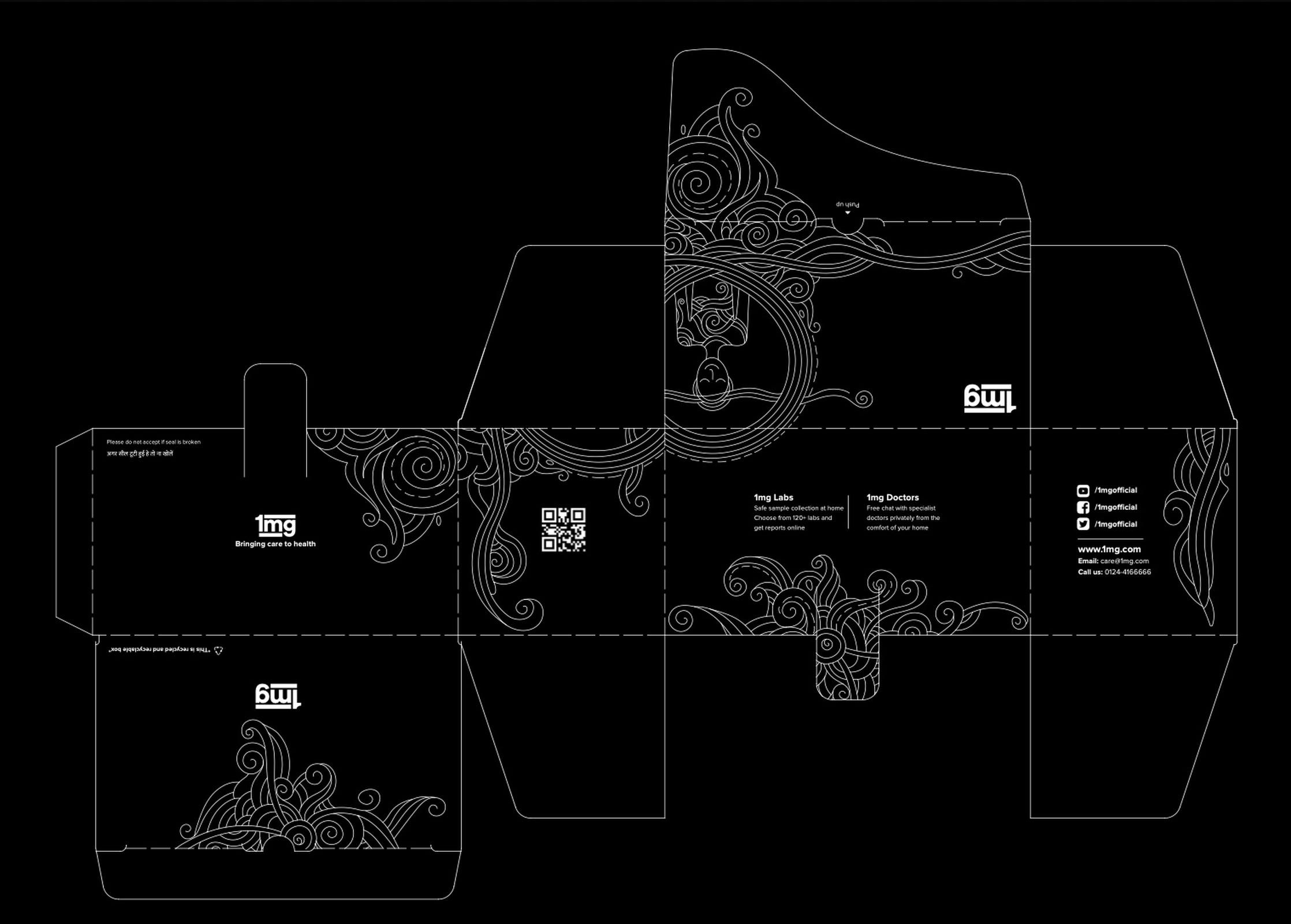
The finalized locking mechanish after testing
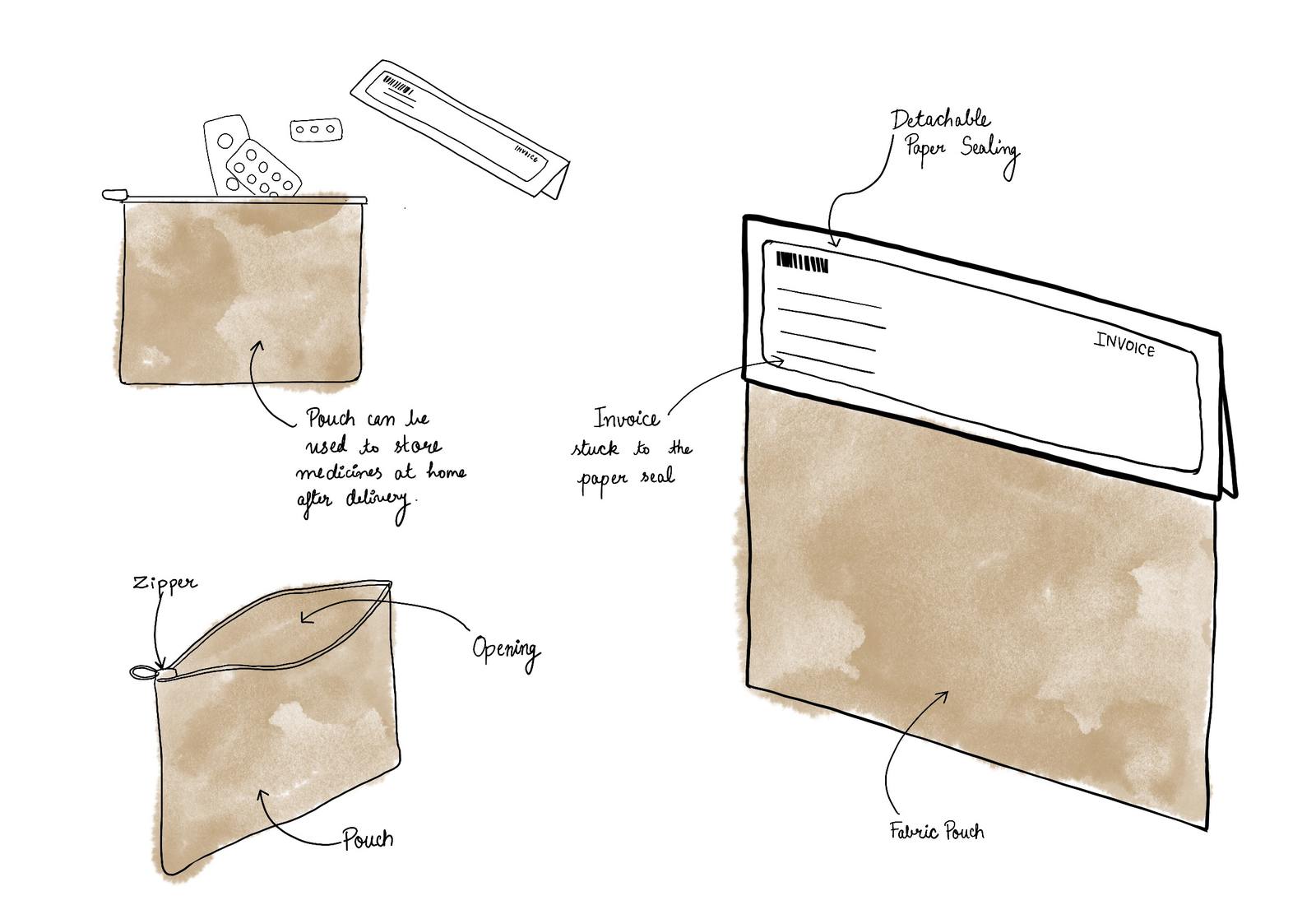
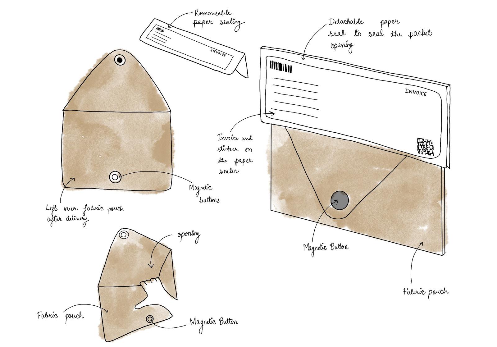
I initially explored cloth bags (potli, zipper pouch, magnetic button) with the idea of creating something reusable and desirable. But after speaking with multiple vendors, the cost of cloth came out to be much more than expected. I pivoted to paper bags, which were more sustainable and cost-effective while still feeling intentional.
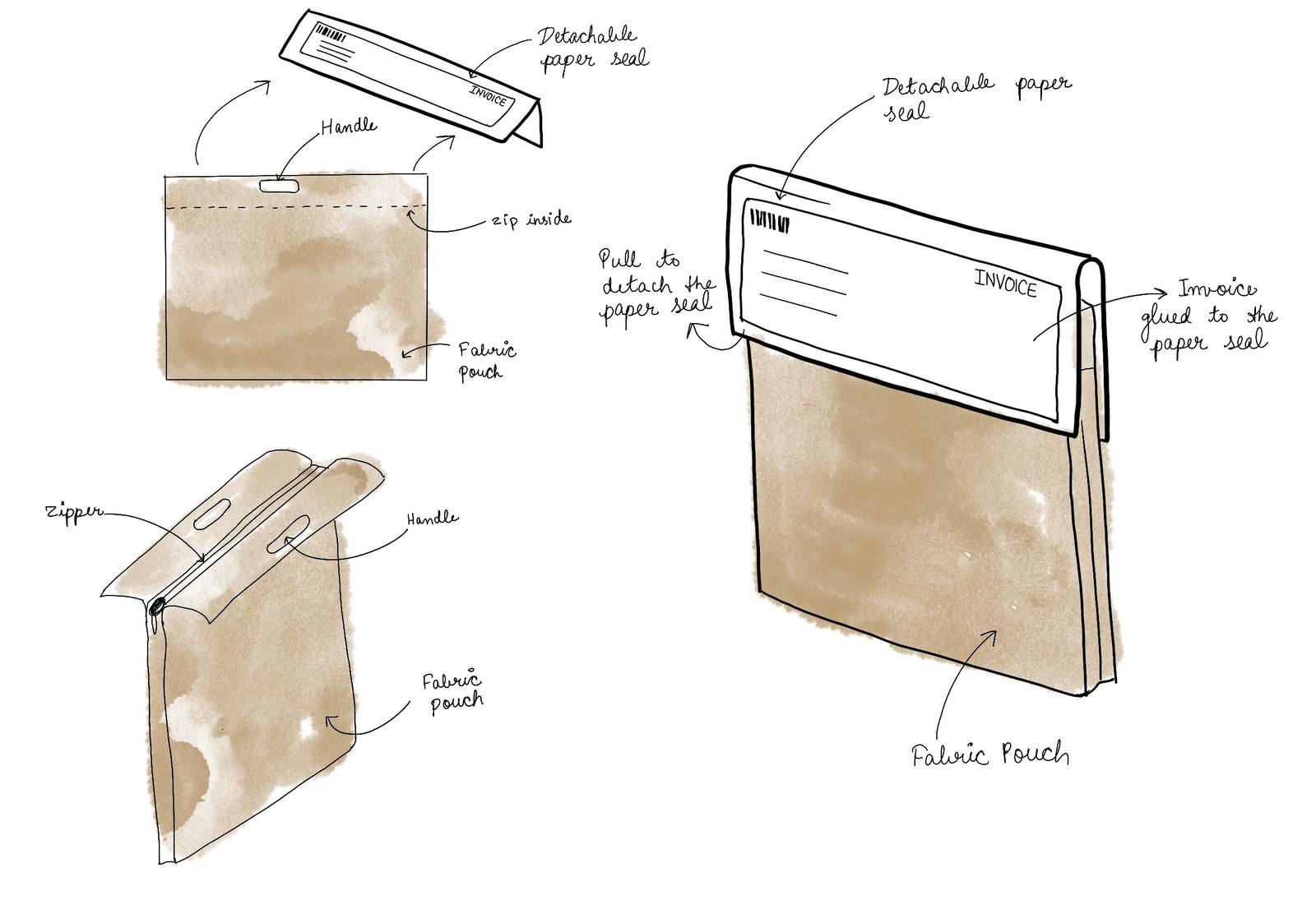
Fabric with zipper
Fabric with button
Fabric with plain zipper
Finalized packasging concept
Medicine is personal. Customers need to know their order hasn't been opened or tampered with during transit. I introduced tamper-evident vinyl stickers to replace generic tape on carton boxes. Once the seal is broken, it's visibly damaged, so the customer knows the package arrived intact. For bags, a double-sided adhesive flap works the same way: the only way to open it is by tearing the seal.
Fragile items like glass syrup bottles were being wrapped in layers of bubble wrap. I tested sustainable cushioning alternatives by dropping packages with fragile contents from various heights until I found materials that protected without plastic.
Self-locking
The flaps fold inward and lock into each other without tape. Scored highest in the evaluation matrix, so I started here. But in warehouses, packers found it fiddly under speed. It added 5 seconds to packing TAT per box.
Snap lock
A tab-and-slot mechanism that clicks shut. Faster than self-locking and required less precision. I tested it on both sides of the box to see which configuration packers preferred.
Hybrid: Snap lock + Tuck-in ✦
Snap lock on one side for speed, tuck-in flap on the other for tamper security. 8-second folding TAT. This is what shipped.
The turning point wasn't internal approval.
Fragile items like glass syrup bottles were being wrapped in layers of bubble wrap. I tested sustainable cushioning alternatives by dropping packages with fragile contents from various heights until I found materials that protected without plastic.
Final System
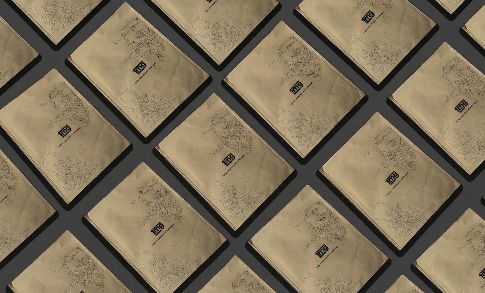
Bags finalized designs
References gathered from leadership and stakeholder interviews