Case study, Juniper
A brand for the pecans of Poonch
Pecans grow in backyards across Jammu and Kashmir, and nobody there had ever farmed them for sale. I grew up in Poonch eating them, so I designed the brand and the online store for Juniper, a pecan brand from Poonch that is now taking reservations for its first batch.
- Role
- Brand and web designer
- Timeline
- 2026
- Team
- Just me on design
- Tools
- Shopify, Claude
- 3flavours in the first batch
- 6brand colours
- 1live store
01
A nut nobody had branded
In Poonch, pecans grow in people's gardens and neighbours gift them to each other in winter. India imports almost all of its pecans, even though they grow here.
There was no existing brand to follow, so I started by deciding what Juniper should feel like. I wanted someone in Mumbai to open the box and be looking at Poonch specifically.
02
A name for a plant nobody noticed
Juniper isn't a pecan. There were juniper plants all over Poonch when I was small, and I never knew what they were until a friend in New Mexico pointed one out. I liked how much we had in common: slow growing, native to a place people overlook.
03
Design decisions
I was the only designer, so art direction was part of the job: what the photographs show, which colours carry the brand, and how the type sits with both. Three decisions held it together.
-
The photographs and the page were designed together
The store sells a small box of jars, so the photographs do most of the talking. Every one is shot on the same pink ground, with fruit and flowers picked to sit beside the palette, oranges and lemons next to saffron and purple flowers next to lavender. Each flavour's jar has a label colour of its own.
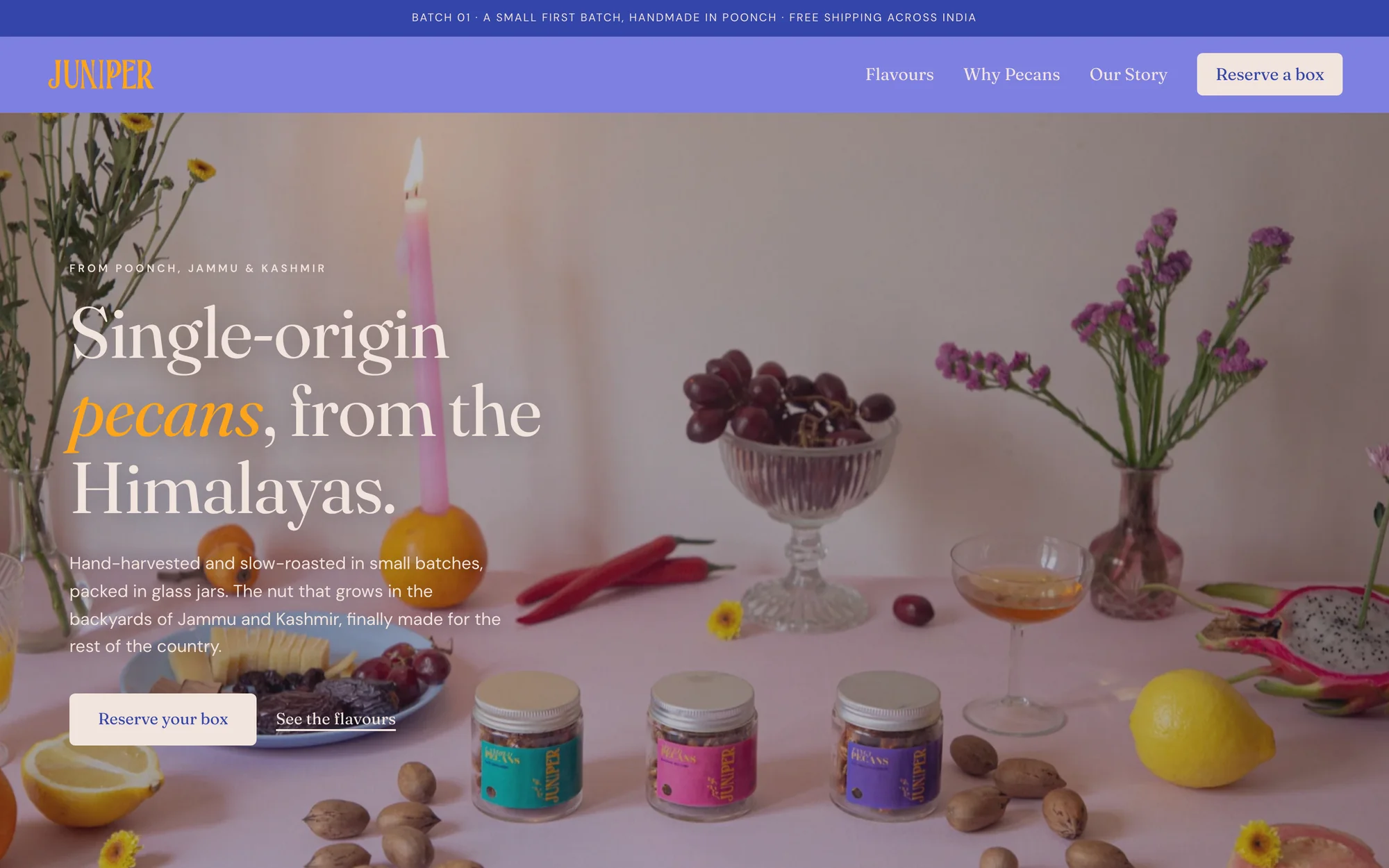
On the home page a flat dark layer sits over the photograph so the cream headline reads on it. It is flat on purpose, because the brand has no gradients.
One of the store's photographs. -
A palette you could recognise without the name
I wanted the colours to stand apart on their own, before anyone reads a word. Lavender with saffron is the signature pair, so the bar and the wordmark use it. Every colour is flat, with no gradients anywhere.
Lavender sits in the middle of the brightness range, so no other colour reads well on it at body size. Long text goes on cream with indigo, and lavender is kept for large type and surfaces. Pink and teal stay small.
#7E80E0
#3445A9
#3EA69B
#E07E9F
#FFA51B
#F2E4DD
-
Colour, photograph and typeface, tuned together
Headlines are set in Fraunces, which has the warmth of an old label, and the small text in DM Sans, which stays out of the way. The home headline sets one word in italic saffron, the colour of the fruit in the photograph under it.
That is the harmony I was after: each of the three repeats something from the other two, so no one of them looks added on.
The top of the home page.
04
The store
I designed the store and built it on Shopify with AI-generated code. The design and the direction are mine: what each page says and does, and what happens when someone reserves a box. I checked the code and fixed what broke.
The first batch is a pre-order. You reserve a box, you can get a full refund any time before it ships, and I email the ship date. The store says plainly that it is a small first batch made by hand.
05
Where it is now
Juniper is live at juniper-universe.com, taking reservations for Batch 01: one box with three jars, Kashmiri Chilli, Hot Honey and Winter Spice. The pecans are shelled, roasted and packed by hand in Poonch.